Step Three of the Subscription Accelerator™ Framework
To recap, the Subscription Accelerator™ is our formula for revving up your paid subscriptions and, with them, your revenue (full video recording available below).
Step one is collecting registered readers, by offering free but limited access to your casual and semi-casual visitors. Step two is sending your newsletter of great content to these readers, teasing them to pay for a subscription.
Even with just these first two steps — collecting free registrations on your website and sending your newsletter out to these free registered users — you’re winning half the battle.
But that brings us to step three: a deep dive on the things that you can do to up the odds that somebody who’s a casual reader that’s in your newsletter now will actually pay for a subscription. Step three has three parts of its own:
- Your messaging: explaining your benefits to these casual readers that you want to convert.
- Your touchpoints and targeting: the moments when you have the chance to use your messaging to hopefully convert that paid subscriber.
- Some easy opportunities: adding additional benefits and revenue to your publication.
Some background: The New York Times Model
All of this, our creation of Leaky Paywall and everything that comes with it, goes back to the New York Times. The New York Times launched their paywall in 2011…with zero digital subscribers. This is the point where we first encounter a lot of print publishers or brand new publishers: when they’re starting fresh with zero.
And now 10 years later, from 2011 to 2021, the Times has grown their paid digital subscriptions to their news. And now they have other products too, like recipes and games and such, but their news platform.
Looking at a chart of their growth, you see something that’s really interesting.

Looking to grow your publication?
Sign up for expert advice straight to your inbox.If you go back to 2011 and you extrapolate, you’ll see a pretty flat, but steadily increasing curve of new paid subscribers. And then somewhere around 2016 (I think was the Trump bump), paid subscriptions jumped to a whole new level. And then even just in the last few years, 2019, 2020, the digital subscriptions actually accelerated for the New York Times.
So, in 10 years, they went from zero to 5.6 million paid digital subscribers of their news product. The conclusion: time is really your friend in this equation. Give it time.
Which takes us to the next data point.
Your biggest opportunity
You will notice that your hardcore readers – your hardcore fans, those that are close to you – will subscribe pretty quickly. They’ll just jump right on board.

And then the next group is your casual readers. And what the data’s showing now is that these casual readers are really your biggest opportunity. They’re the biggest portion of your audience. And, therefore, they actually translate to your biggest potential as far as new subscribers go.
But again, it takes time. So what you need to know is how, over time, you can make the experience of your publication for these casual readers better and better.
The experience, from beginning to end
Something that we went through ourselves, not that long ago, was essentially how to onboard new, in our case, publishers, and in your case, paid subscribers.
And the onboarding experience, something that was a real light bulb for us was that the onboarding experience starts with the first view of your website. And you want to, from the very beginning, as Samuel Hulick would say, show the top of the mountain. So in other words, you, as a publisher, want to offer lots of features and benefits to your paid subscriber.
Really what we see is publishers offering mostly features. But what’s the benefit to the reader? What’s that singular benefit that your reader gets when they become a paid subscriber, when they become a member?
For a local news publisher, when they join the community, what is the benefit to that? Magazine publishers, let’s say they’re also joining a community of like-minded enthusiasts. What is the benefit? How does life get better for your subscriber?
And you want to think about that at your first point of contact and then at all other points of contact in the experience of bringing that casual reader into the paid subscriber.
So you’re always onboarding. That’s sort of the point. And by the way, Samuel Hulick wrote a really terrific book called User Onboarding. It is excellent. It’ll absolutely open your mind up in terms of how to approach your customers, or in your case, your subscribers or members. Really terrific.
Step One: Mind your messaging
One of the things that we see, in onboarding and beyond, is that it’s very tempting to throw advertising at your readership saying, “Hey, join now!” with discounts and promotions and email blasts and such.
Be very careful of that. That affects the experience that you’re bringing on. You want this kind of messaging to happen slowly over time and you want it to fit your brand. You want it to be sort of gentle, not aggressive advertising, and you can work that into all your touch points.
One of the things that you can do too, is as all organizations struggle to sort of find that tagline or that messaging is to ask your own readership, your best subscribers, why they pay you. And that will help you come up with the real reason and the big benefits to your readership, which will help you architect the experience that you want to architect.
First contact: email newsletter
Let’s get into some brass tacks here. The first point of contact, which is really the most important, is the email newsletter that goes out. And this is the thing we’ve talked about before if you’ve listened to any of the previous episodes. When you get that free registered user, now you’re sending your newsletter to that person over time.
It’s likely the second largest source of paid subscriptions. Sometimes it’s first, sometimes it’s third, but typically it’s about number two. It’s a great conversion tool.
And because your email newsletter is so important and really your main direct marketing tool: you need to make it awesome.
Take a step back
So now’s the time to really step back and look at it. If you’re using MailChimp or Constant Contact or really any other email provider, and you haven’t stepped back and really decided to match your brand, that’s worth the money. You’ll get that money back so many times over.
Make it clean. Make it readable. We’ve got a great example.

We’re looking at Small Boats Magazine. There’s a free registration level. Readers can also sign up directly and get that email newsletter. It’s a great model of what it can look like. Now it is a magazine, but it’s got something in it that I think every publication really needs to have. And that is a call to join in every newsletter.

They do a great job with this. It’s not intrusive; it’s underneath the main content. They send it regularly, in your case, every day or every week or every month. And essentially it says, “Join the Small Boats Community and you’ll receive…” And then there’s a list of bullet points, six bullet points of benefits that you’ll get. And then there’s a big button underneath that that says “Join Small Boats today”.
And it’s that messaging in the email newsletter that works over time. You’re not beating somebody over the head with, “Hey, subscribe!” or “Hey, discount!” or whatnot. It’s just an essential part of the newsletter experience: “If you’re not already a member, join. This is how our content is going to help you. This is how it’s going to benefit you and change your life.” That’s the angle you want to come from.
So, to sum up, your email newsletter is really the number one direct marketing tool available in the toolkit. And you want to make it awesome.
Sidenote: Subscription Messaging
Another thing that Small Boats does well — that not everyone does — is putting the list of benefits by the Subscribe button.
A lot of people will say, “Hey, subscribe today.” But Small Boats has that list of those six benefits of why you should. Which is great because sometimes it’s hard for a subscriber to know all the different things they can get just by looking at your website. So they spell it out right there.
They have a landing page, which warms the reader up to what the benefits are for the subscription.
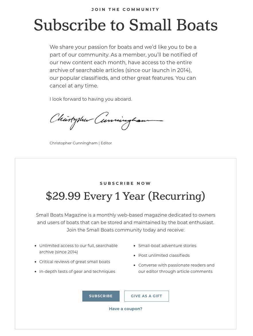
It has the “Subscribe to Small Boats” messaging at the top. Then there’s a neat little intro paragraph with a signature from the editor. And then beneath that block it’s the price and then the bullets and benefits of what you get if you subscribe.
This all accomplishes a very crucial goal: it simplifies their touchpoint. The fewer offers you have, the less confusing it is for the potential subscriber, and the more likely it is that they’ll make a decision and actually pay for a subscription.
Netflix has really proven this. It’s a recurring monthly offer and that’s it. There’s no annual subscription. There’s no three month subscription. You can’t buy individual episodes. It’s just recurring monthly, and that’s it, no other choices.
Small Boats offers one year, recurring. That’s it. If you look closely at their subscribe page, you’ll see that they also call out their gift subscription at the same time. So it’s the same subscription, but either you buy it for yourself or you buy it for someone else. And that’s it. The gift subscription is part of that opportunity section that we’ll talk about later.
And any publisher could benefit from adding these things to their own newsletter and their subscribe pages, calling out more of what the actual benefits are of subscribing.
Using email drip campaigns
One of the best ways to use the email address from someone’s free registration is to target them via email, but in a nice way. And that’s through a drip campaign, which is possible through most email service providers (Ex: Mailchimp).
So what is a drip campaign? It works like this:
When somebody signs up for a certain subscription level — let’s say the free level — you’ll send a “free level” tag to MailChimp (or whatever service you use). And then you can start off a campaign of around five emails, which drip out over the course of 30 to 60 days.
What’s the purpose of these emails? The purpose is to help explain how your publication will improve the life of your paid member. What are they going to get?
This takes us back to that benefits list. Every publisher has a lot of different benefits that are part of the experience. For example, it could be joining the community. It could be having access to events, or being able to comment as a paid subscriber on the site. Small Boats actually provides access to unlimited classifieds posting, which works really well for them. And then, of course, there’s essentially the big benefit: the emotional appeal of helping your publication survive. Don’t be afraid to tell them, specifically: we need subscription income or membership income. They honestly might not know. And that works exceptionally well.
So, all that kind of messaging — in terms of what the feature is, what the benefit of the feature is to the reader, how it will help them — you can drip that out over time, in a nice, gentle way, so it’s not a hard sell. It’s really more of an education of who you are, why you need their support.
And then, ultimately, in each email you have that ‘Join Now’ button so that every time you touch somebody, you give them the opportunity to join. And that’s what works.
We get emails all the time from organizations we’ve given to in the past and they keep pestering us again, in a nice way.
Wikipedia does a great job with it. They’re really good at focusing on the benefits of being a contributor. And I don’t give them a lot, but I give them something, and not every time, but sometimes, but they keep on me. Time wins. The chances of me giving increases as I don’t give. And then I finally decide to give. And that’s how this process succeeds.
So, drip campaigns. Consider setting up a drip. It’s super easy to do. I think MailChimp charges you 25 bucks to turn on that feature per month, and all those free registrations that come pouring in really, you’ll have more free registered users than any other type of subscriber. Typically can be essentially in a nice way asked to pay over time as you drip them emails.
Step Two: Touchpoints and Targeting
I will say, just to be thorough here, that when people do subscribe on your site, be sure to assign a tag to that subscriber and send that tag to an email provider like MailChimp. Try to keep the tag simple.
In other words, if you are digital only, then it might be just free and paid. Regardless of whether they’re monthly or annual or not, you could start to really break these out as monthly and annual. But what we hear are back from publishers is that this gets complicated to manage. So start simply. You can get complicated later.
If you’re a print publisher, you’re probably going to have free digital, paid, and print-paid as your main categories. And with those tags comes the power to send promotions to each level. So you can target your free tagged subscribers with a promotion. But just be really careful. You don’t want to train people to expect discounts. Those are really dangerous waters.
You can however, promote, for example, your gift subscriptions.
(And here’s a note on gift subscriptions: From the print magazine industry, if you have a giftable publication, about 20% of your subscription revenue should be in gifts. Which, when we look at our network of publishers, is not generally happening.
So there’s a lot of money on the table by really going after gifts on a regular basis, certainly during the holidays, but year round. Gift promotions work and can be a big part of your revenue.)
So, who’s likely to maybe give a gift subscription during the holidays? Well, definitely your paid readers.
Free readers, maybe. They’re somewhat committed to you as well. Maybe you can create a crafty benefit to the free reader: they can get a subscription and give a subscription, maybe through a coupon code or similar. That would be a smarter way of targeting without actually giving a discount.
But consider that. Make sure that your tags are getting sent into your email provider.
On-site targeting: New visitors
So how do you target your messaging on your site?
The first thing you should always do is walk through the process like a new visitor to the site. Go to your website, don’t log in, trigger your first subscription message, the nag — this may be a paid subscription message, but hopefully, it’s the free subscription message — and see what it looks like. Is it the default subscription message?
I cannot tell you how many times we go to a publication and we trigger the subscription message that says, “Hey, you’ve run out of articles. You need to join for free or pay,” and it’s the default subscription message.
As we said earlier, this is part of your brand, part of the experience that you’re onboarding your potential subscribers with. So: a clean, branded box, with your logo, colors, and elegant messaging. And hopefully attractive to your free level subscribers. That’s all you want to promote: “Hey, join for free, read the article that you’re looking at right now. Maybe get one or two or three or more free articles per month.” And that’s it.
The purpose of that first touchpoint on that subscription message is to collect the email address, because then they’re on the newsletter and then you’ve got them. Now you have time on your side to convert them to paid. That’s it. Yes, you should give them a link to log in, and yes, you give them a link to subscribe, but keep it focused on that free registration.
On-site targeting: Free-level subscribers
For your next trick, go and log in as a free level subscriber. (There’s a user switching plugin that you should install, if you haven’t already. So you can go to your subscriber table and just switch to a free registered user, so you can trigger your paid messaging).
Look at some articles, hit the paid subscription nag. And what do you see? Do you see the generic message or do you have a nice branded message?
Back to the example of Small Boats.

They’ve got the ‘upgrade your account’ message: a logo, “Upgrade your account” in big text, and then “subscribe now”, the price, the benefits, and a button that says “Subscribe Now”, which takes you to that nice subscription landing page.
And that’s it. It’s part of the experience.
Remember, over time, this message will be shown multiple times, which is what you need to do today. You need to show your messaging multiple times to gain attention. So you want to keep it elegant. You want to keep it simple. There’s one button there. It’s a clear call to action. And you want to pester people over time with this.
So, if you have the default subscription message or upgrade message, it’s time to take a look at it.
And again, whatever investment you make in time, or getting a designer to do some light design work (it won’t take much), will pay off. Anytime we see new designs in the digital space for websites or email campaigns, the results are dramatic. It takes time to put this together, but once you have a cohesive design and experience, especially messaging, it works and it works like gang busters.
Give yourself the gift of time to look at how your subscription experience works.
Sidenote: Subscription options
Now let’s take a look at subscription options.
We can’t all be Small Boats and have one subscription option. Sometimes we sell print and we need to have more than one subscription option.
So, here’s a little note on the weird human brain: psychologically, we respond best to things grouped in threes. If we have choices of three, then it’s easy. We can pick: one, two, to three. So as far as your subscription page goes, three or less items to look at, is your best bet. So you might have a digital, you have a print digital, and maybe there’s a membership, a higher level that you’re offering. That’s it, three choices.
If you need more, you can subdivide on the subscription card itself. For example, on each subscription card choice, you could have buttons for monthly and annual.
It’s the same option, say digital only, but with the choice of monthly or annual. For print, maybe it’s just annual. And then membership is whatever. And that’s it.
So if you have one option, great, you can really work on the messaging for that landing page. If you have two or more, stick with three and offer your gift subscriptions, offer your corporate subscriptions underneath as really kind of an add-on, and things that you might target separately, promote separately.
On-site targeting: header bar promotions
Here’s another onsite targeting trick that works really well, but doesn’t pester too hard. It’s what I call a header bar promotion. (Though the technical name is “conditional display notice”.)
What does this do? This puts a little thin header bar at the top of your website. And the cool thing about it is, is you can target what subscription level to show it to.

In this example, you see a brown header bar that says, “You have unlocked a reward: Get your first month free with our annual subscription,” and there’s a link to the annual subscription registration page.
This is a promotion that is set to only display to free registered subscribers. If I’m a casual visitor, I won’t see it. If I’m a fully paid subscriber, I won’t see it. I’ll only see it if I’m a free registered user. So, if I’m not already paying for it, but I’m logged into the site, I see this bar with its reminder to upgrade.
And what’s cool is now you can really target and message specifically to that person and the state that they’re in.
If you wanted to promote gift subscriptions, you would use this header bar to promote gift subscriptions for the holidays to anybody who’s logged in as a paid subscriber. Run that for a bit and see how that goes.
Change your content, your text. Test it for promotions. This is a fast place to change things up, try different promotions and see what works for you.
The conditional display notice is pretty, pretty cool that way.
On-site targeting: In-content messaging with Ad Dropper
You can use our Ad Dropper add-on to display messages on your website, based on the reader’s login state. For instance, you can hide your subscription-oriented ads from people that are already paid subscribers or paid members. And that’s pretty powerful.
Imagine being just a casual visitor from Google (or from Facebook, or maybe I’m a free registered and logged in user) and when you go to read an article, you see a promotion in-content or in the sidebar. And that’s great.
That promotion could be anything. It could be text, could be an image, could be a video, whatever you want. We always recommend keeping it clean and simple, but make it compelling so the reader will click on it.
But the paid, logged in subscriber won’t be bothered with irrelevant messaging. That message will be hidden from them.
For mobile, especially, the in-content messaging works.
And now you have the ability to show subscription promotions to folks that are not paid subscribers, without bothering the paid subscribers.
So that’s a hidden feature to Ad Dropper. Certainly you can use it to run regular ads, but consider it a great way to target your casual and your free registered readers.
Sidenote: Newsletter incentives
You can always offer something extra to get people on your newsletter, like a free e-book or some other bonus content.
This can is a way to catch people who maybe wouldn’t sign up a different way as a free registrant or even just to get them on the email newsletter. Offering some kind of e-book or access to a download can be get even more people on your email list.
A download is compelling and not necessarily difficult to build. Maybe there’s a section on your website that you’ve built specifically for somebody who signs up. Maybe it’s a bonus issue using IssueM that someone gets for free. And getting people on the list — whether it’s through a free registration or as a pitch to download something for an email address or be sent a PDF via email — works really well.
Downloads and giveaways are a great gambit for social media, too. If you’re exploring Facebook, for example, to promote subscriptions, then what works is promoting something for free. Because free is always compelling and you want to grab those email addresses, which is the whole point of a free anything in the digital world.
So if you have a PDF to give away, test that in Facebook. If you have a section of content that you have reserved for anybody who signs up, give that away. You can certainly promote a free registration to get a certain amount of articles for free. These are things that you can test actual results. You’re not just getting clicks. You’re looking at, hey, are people joining the email list?
Once you have them on this list, you can pull them into that email cycle of showing off all the benefits you have and encouraging them to subscribe down the road.
(We haven’t even talked about targeting outside your own website, but when you get into Facebook and LinkedIn messaging, when you’re offering that thing for free, you can track with UTM codes, which you attach to the free download links. You can track exactly how folks came in to claim your free offer, whatever that may be.)
Step Three: Creating opportunities
There’s a lot of things that you can do with digital that can generate additional income.
We talked about gift subscriptions being 20% of paid subscriptions.
We talked a little bit about making sure your gift button or call out is visible on the subscribe page.
Donations
Another quick boost is emailing and targeting your paid subscribers for donations. If you’re a mission-based publication, you should absolutely be asking for donations as well as paid subscriptions. You can do both and we’re seeing more and more publishers go after both, and it works.
Going ad-free for premium members
Another thing you can do, if you want to test something out, is create a premium plus level. So, you have your paid subscription levels, but you may be able to charge a little bit more per month or per year if you remove ads, which you can do with Ad Dropper.
Now, we get a pretty common knee jerk reaction from publishers that say, “Oh, well, no. No, we don’t want to do that.” But the reality is that your paid subscriber base is a fraction of your actual reader base. Compared to your casual reader base that comes from outside sources and your free registrants, it’s very small. And all of those readers will still be viewing your ads.
The other reality is that when you have an email address, you’re sending people back to your content. So you’re generating more page views, not less. You’re actually growing your traffic with any kind of registration process, free and paid.
So removing the ads for your premium members is very fractional and it might make a big difference to those readers. Someone might say, “You know what? I don’t want ads. That’s great.” I mean, the banner ad world is a battle of attention right now. And you have 40% of people using ad blockers. I mean, it’s very clear the opinion on banner ads. So why not charge a little bit more to hide them? Just get right out front with it.
Creating a family & friend subscription
Creating a family subscription is a great way to circumvent password sharing. People hand around their password to friends and family like they might the actual print edition of their local newspaper or a physical magazine.
Instead, just move that part of the benefit forward and say, “Hey, you and up to four or five family members can gain access to the publication.” You’re just having that conversation right upfront. It becomes a benefit.
Or, “Feel free to share your magazine subscription with a friend”. You can give a limited-access subscription by creating a hidden subscription level, let’s say free, but only three months or two months, or some period of time of your choosing.
And then, when someone signs up, they know that they’re going to be able to give away a completely free, full access, premium subscription to someone else of their choosing for a couple months.
And that helps build your email list, helps get your brand out. And it really takes advantage of the viralness of email (and email is the original viral platform).
Plus, it’s word of mouth. That’s what you want. You want somebody saying, “Hey, this is great. Here’s a free subscription. These guys are awesome.” And then you have a much higher chance of converting that free subscriber.
Classifieds & calendars
We mentioned Small Boats has a classified section. If you join as a paid subscriber, you can post unlimited classifieds. After they launched this, their classifieds doubled in quantity and their paid subscribers went up just with a simple push.
People that came in with boats to sell, decided, “What the heck, I’ll just become a subscriber.” So they could sell their boat and subscribers got that additional benefit of being able to post classifieds.
You can do the same with an events calendar, letting paid members post on your events calendar. With Leaky Paywall and WordPress, since we’re all sharing the WordPress user cable, it’s super easy to turn on permissions for paid subscribers to be able to have access to posting on a calendar or in classifieds.
And these are just some of the possible opportunities. If you put some thought into it, you can probably come up with a dozen more.
Your homework: test out your experience
So, we’ve done a deep dive on the messaging benefits.
We’ve talked touchpoints and targeting, we’ve brainstormed some opportunities.
If there’s one takeaway here, it’s this: go sit down with a cup of coffee and some quiet, turn off all your notifications*/=/*=-09876543567890-kkusghghmnlkl’ and spend an hour just going through the subscriber experience.
Think about how you can onboard that new paid subscriber from their first view of your website and all the touch points that you go through personally as you go from casual to free to paid. Understand how and what your emails say, what things look like. Is it an elegant experience? How does this experience play out over time?
So that’s your homework.
A good technique for this is to have Keynote or Google slides or Powerpoint open and take screenshots of each of the steps of that onboarding experience: the website, the emails. (We use the Skitch app for the screenshots.)
Then you have all that in one space that you can look through. Start by one thing in each of those items to improve. Sometimes it can feel a little overwhelming.
So if you just concentrate on one thing at a time, you35676766768.890-7657890i389724 can see those benefits ratchet up over time.
Last note
If you are new to Leaky Paywall, download the full Subscription Accelerator™ Framework. If you have any questions, we love answering questions, especially questions about growing paid subscriptions. Please reach out and we will be sure to answer.
