Mexico News Daily, a Leaky Paywall publisher, grew from about half a million monthly readers to over two million in two years.
That’s a publication doing a lot of things right. But its subscription page still leads with a line many publishers use: “Get unlimited access.”
Nobody wants to buy unlimited access. Readers don’t pay for access. They pay for what your reporting does for them.
In this episode of the Paywall Podcast, Pete tears down the Mexico News Daily subscription page: what’s working, what isn’t, and how to write benefit copy in minutes with AI.
Listen to this episode on the Paywall Podcast
What do readers actually pay for?
Your readers pay for the result of your reporting, not the articles.
They feel out of the loop. They want to know where to eat, how to vote, what to do this weekend, and how to feel like a local. That’s especially true in local news.
Your subscription page has one question to answer: how does my life get better if I pay?
Where do subscription page visitors come from?
Registered readers are the best traffic your subscription page gets.
When a Mexico News Daily reader runs out of free articles, a registration wall asks them to create a free account or log in. Once they sign up, Mexico News Daily can track their behavior and send subscription offers to the most engaged readers. The email also flows into the newsletter, so every signup is one more reader coming back.
Looking to grow your publication?
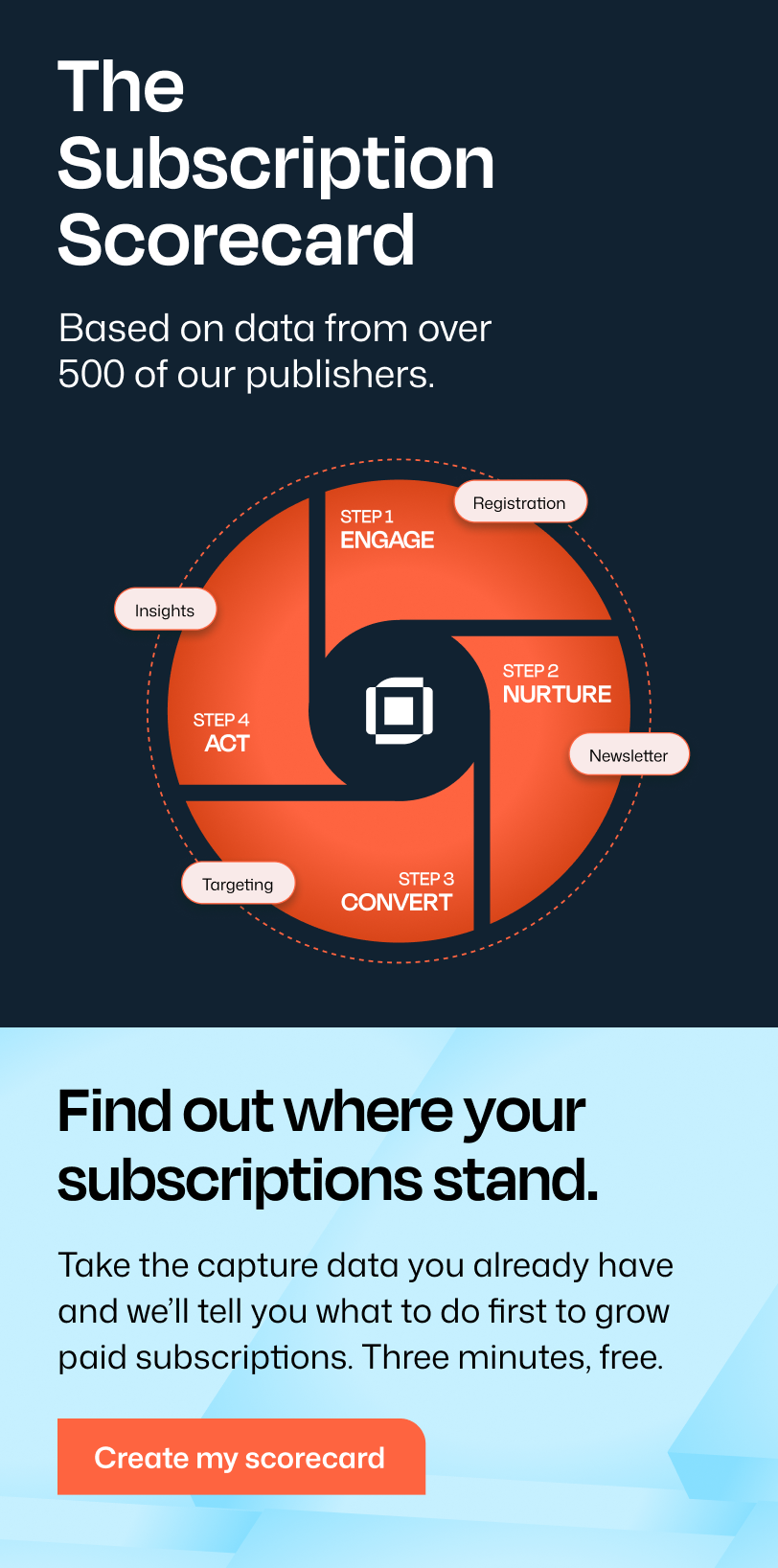
Sign up for expert advice straight to your inbox.That’s the Publisher Flywheel(TM) at work: free registrations build the list, and the list drives paid conversions.

If you don’t have a registration wall, set one up today. Leaky Paywall’s List Builder puts one in front of your readers so your email list grows with every article.
Two quick wins on the site itself:
- Make your subscribe button stand out. Mexico News Daily highlights its subscribe link in red. Your subscribe button should always be visible and pop out of your menu.
- Put login right next to subscribe. Top right of the site, side by side. Once a reader logs in, swap it to “My Account.”
Does your subscription page pass the 10-second test?
Land on your own subscription page as a reader. In 10 seconds, do you see a better life?
On the Mexico News Daily page, you see an individual plan, a family plan, and some links that take you off the page. You don’t see why any of it matters to you.

The Atlantic gets this right with one headline: “Journalism that explains America and the World.” Their reader wants to understand what’s happening, and the headline promises exactly that.
How do you write benefit copy with AI?
Your About page already has the raw material. AI turns it into benefit copy in minutes.
- Open your About or Mission page. Many publishers already have one.
- Start a new chat in Claude or ChatGPT.
- Use a prompt like this: “Write short benefit copy to motivate readers to subscribe. Here’s our About page: [link]. Use the StoryBrand framework.”
StoryBrand comes from Donald Miller’s book Building a StoryBrand. It casts your reader as the hero of the story and your publication as the guide that helps them win.
When Pete ran this with the Mexico News Daily mission page, here’s what came back:
- Make smarter money moves in Mexico.
- Never get blindsided by a rule change.
- Feel like a local wherever you are in Mexico.
- See past the scary headlines.
- Know where to go before everyone else does.
- Understand where Mexico is headed.
- Share it with your whole household.
- Keep independent English-language news in Mexico alive.
Every line is about the reader and how their life improves. That’s copy you can use across your whole site.
What belongs on a subscription page?
Your subscription page is your money page. Treat it like an e-commerce checkout.
- A big benefit headline.
- One or two lines of benefit copy underneath.
- Your pricing cards.
That’s it. No menu, no ads, no links that send readers away. Just your logo and your offer.
Why? Readers on this page are already thinking about paying, and they want to know what it costs. Tell them how their life gets better, then show them the plans.
Which pricing cards should you offer?
Three cards is the right number.
When Pete reviewed the Mexico News Daily page, it had three:
Card 1: Individual plan. Digital access with a monthly/annual toggle on one card. This is a great setup. Copy it.
Card 2: “Upgrade me.” This one is for existing subscribers switching to the family plan. A new visitor probably can’t tell that from a button that says “Upgrade me.” Pete’s take: “I don’t know what that means.” Move it to the account page.
Card 3: Family plan. This one converts. At the time of the review, Mexico News Daily charged $15.99 a month for you plus two more people, versus $8.99 a month for an individual plan. It’s an easy upsell for local news, and you can be as generous with seats as you like. Pete would consider going to four.
Here’s the lineup Pete recommends:
- Individual plan (monthly or annual)
- Family plan (the next easy upgrade)
- Gift subscriptions
Don’t sleep on gift subscriptions
Pete’s rule of thumb from print: a magazine doing well with paid subscriptions gets about 20% of its revenue from gifts.
Digital is a different animal, since a physical magazine makes a nicer gift. But Pete estimates you could reach 5 to 10% of revenue from digital gift subscriptions if you put real effort into it. Promote gifting to your paid readers, especially around the holidays.
Add a fourth card for groups
Below your three main cards, add a full-width card: “Does your organization need access? Get in touch.”
That opens bulk-access conversations with government offices, schools, and libraries.
Coffee shops work too. Pete knows local news publishers that give free access to anyone sitting in a partner shop, no login needed. In exchange, the publisher gets a QR code and its brand on every table. That’s exposure across town plus a yearly contract.
What goes below the pricing cards?
FAQs and a way to reach you.

Civil War Monitor follows the same core layout: title, benefit copy, pricing cards. Underneath, a frequently asked questions section answers what a buyer is wondering:
- What is The Civil War Monitor?
- What do I get if I subscribe?
- How do I access the website if I’m a subscriber?
- Can I purchase a gift subscription?
At the very bottom, they list an email address and a phone number. A reader who scrolls that far still has a question, so give them a way to ask it.
Where else can you convert paid subscribers?
Your login page and your free newsletter.
Your login page
Northshore Magazine added one line of text to its login page:
Not a subscriber yet? Join us here for full access to Northshore’s curated content across all channels.

Real result: that line brought in 15 new subscriptions in 30 days. Only Instagram drove more signups (22), and the login page beat every other source on revenue, including paid Facebook, Taboola, and renewal emails. Read the full Northshore story.
Your free newsletter
Your registration wall is building a free email list. Use it.
Every email should carry a small subscription promo at the top and a bigger one at the bottom with all your benefits listed. Use the same benefit copy you wrote for your subscription page.
Bottom line
The mistake Pete sees across hundreds of publishers is the same one: selling features instead of benefits.
You’re not selling articles or all access. You’re selling a better life for your reader, the hero of the story.